
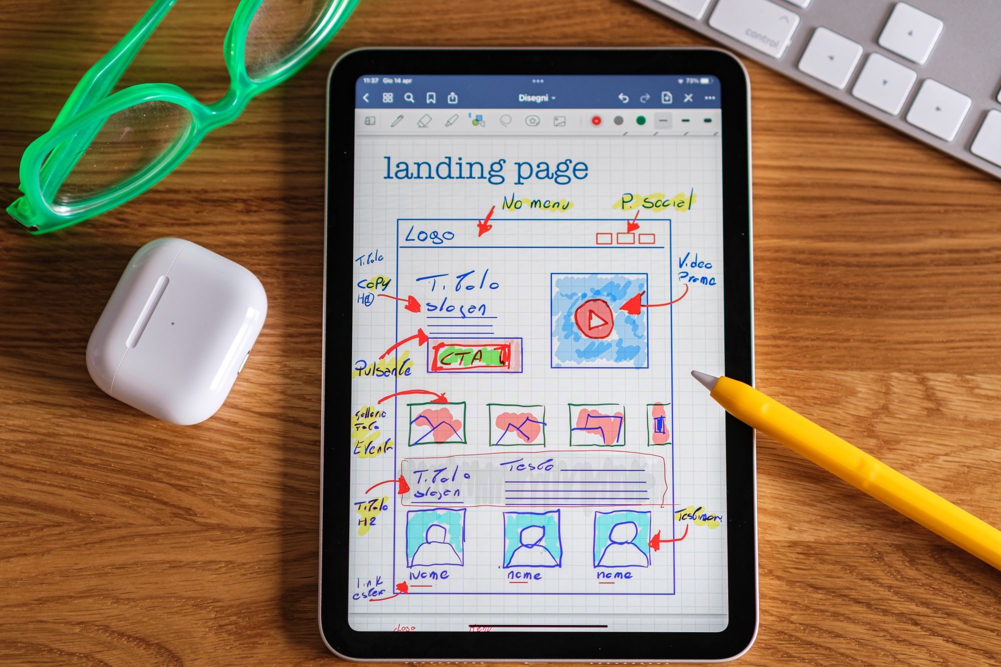
If visitors reach your website, click around for a few seconds and leave without buying or getting in touch, the culprit is usually not your design. It is your information architecture: the way your pages are grouped, named and linked so people can find what they need and do what they came to do. Get that structure right and you often win more customers without spending a penny on new features.
Website builder Wix has published a beginner’s guide to information architecture (IA), the practice of organising, structuring and labelling the content on a website so visitors can act without friction. As Wix puts it, even a polished site will frustrate people if the underlying structure is muddled. That is the hidden blueprint behind every good website, and fixing it is one of the cheapest ways to lift enquiries and sales.
What information architecture actually means
Think of IA as the blueprint behind your website: how your pages are grouped, what you call them, how they link together, and the path a visitor takes from landing page to enquiry or checkout. It is not the visual design, the colours or the fonts. It is the skeleton underneath that decides whether someone can move through your site without stopping to think.
Wix notes that good IA draws on three things: your users, your content and the context your business operates in. In plain terms, that means understanding who visits, what you are offering them, and the situation they are in when they arrive. A cold prospect comparing three quotes needs a different route through your site than a returning customer looking for your phone number.
Why “hidden” is the operative word
You rarely see IA when it works. A visitor lands, spots the menu item they expected, clicks it, finds what they came for and takes the next step. Nobody praises a menu. But when the structure is wrong, people feel it instantly: they hunt, they backtrack, they open the wrong page, and then they leave. The damage is invisible in your inbox because the enquiry that never came does not announce itself.
Why muddled structure costs you customers
The payoff of getting IA right, according to the Wix guide, is threefold. Visitors get a smoother experience and are less likely to “bounce”, which means leaving without acting. Your content works harder because every page has a clear purpose. And your site becomes far easier, and cheaper, to update as your business grows.
Turn each of those around and you see the cost of poor IA. When people cannot find the service they want, they assume you do not offer it. When two pages compete for the same job, neither reads clearly and both underperform. When your menu has grown by accretion over five years, every new addition makes the whole thing harder to navigate, and eventually you are afraid to touch it.
There is a search dimension too. Search engines follow the same links your visitors do, and a clear structure helps them understand which pages matter and how they relate. If you are already working on local SEO to win Google’s map pack, a tidy IA gives that effort firmer ground to stand on.
A practical process for busy owners
Wix lays out a step-by-step approach that any small business can follow, even without a design team. You do not need software or a workshop. A pad of paper, a handful of real customers and an afternoon will get you most of the way.
Define your goals
Decide the main action you want visitors to take. Wix uses the example of an accountancy firm: if signing new clients is the priority, the navigation should not push the blog ahead of the services page. The same clarity applies if you invest in the best AI accounting tools for UK small businesses, because a slick back office does nothing if prospects cannot find how to hire you. Name the single most important action first, then let everything else support it.
Research your users
Simple surveys, one-to-one interviews or small focus groups reveal what people actually want, rather than what you assume. You will often discover that the language you use inside the business is not the language customers use when they search. That gap between your words and theirs is one of the most common reasons visitors fail to find the page you built for them.
Build a user persona
A named, fictional “typical customer” keeps your decisions grounded in real needs. Give them a job, a problem and a reason for landing on your site. When you are deciding whether a page belongs in the main menu, you can ask a concrete question: would this person look for it here? That is far more useful than debating in the abstract.
List your pages
Write down each page with a one-line purpose. If you cannot describe a page simply, it may need splitting up, or it may not need to exist at all. This inventory is often the moment owners realise they have three near-identical services pages, or a contact route buried where nobody would look.
Test the structure
Techniques like card sorting (asking people to group topics) and tree testing (checking whether they can complete tasks) show where your menus confuse. Card sorting tells you how customers naturally group your content, which may differ from how your business is organised internally. Tree testing then checks whether someone can actually complete a task, such as “find how much an initial consultation costs”, using only your proposed menu labels.
Finalise a sitemap
This becomes the map for your menu and layout. A sitemap is simply a diagram of every page and how they nest under one another. Once it is agreed, building or rebuilding the site is mechanical, because the hard thinking is already done.
Choosing an approach that fits your business
How much of this process you run depends on your size, your budget and how much your current site is costing you. The table below sets out four realistic routes so you can match the effort to the payoff.
| Approach | What it involves | Effort | Best for |
|---|---|---|---|
| Kitchen-table audit | Sketch pages, agree one key action, ask three customers to find things | An afternoon | Micro businesses testing whether IA is the problem |
| Full Wix process | Goals, user research, persona, page list, card sorting, sitemap | A week or two, part time | Firms rebuilding a site that no longer reflects the business |
| Card sort and tree test only | Focused testing of your existing menu with real users | A few days | Sites that look fine but leak enquiries at the navigation |
| Hire a UX specialist | Professional research, testing and structure recommendations | Weeks, at a cost | Larger sites where lost sales clearly justify the fee |
Most small firms start with the kitchen-table audit, because it costs nothing and quickly tells you whether structure is your bottleneck. If the audit confirms people are getting lost, you can step up to testing or the full process with confidence that the work will pay back.
Getting your labels and menu right
Labels do a surprising amount of the work. A menu item called “Solutions” tells a visitor nothing, while “Bookkeeping for tradespeople” tells them exactly what they will find. Wherever you can, use the words your customers use rather than internal jargon or clever branding.
Keep the top-level menu short. A handful of clear choices beats a long list that forces people to read every option. Group related pages under sensible headings, and make sure the single action you care about most, whether that is a quote request, a booking or a call, is visible without hunting.
Consistency matters too. If your service is called one thing in the menu, another on the page and a third in your marketing, you split attention and dilute meaning. Pick one name and use it everywhere.
Where information architecture meets the rest of your operations
Your website structure does not sit on its own. It feeds, and is fed by, the tools you already run. If you use a customer relationship system to track enquiries, the way people reach your contact form shapes the quality of leads that land in it, which is worth bearing in mind alongside your choice from the best CRM for small business in 2026.
The same joined-up thinking applies to how you run marketing. A clear IA makes every campaign easier, because you always have an obvious page to send people to, which suits a lean approach to marketing on four hours a week. And if you handle enquiries at scale, a logical structure helps a support tool point people to the right answer, which pairs well with learning how to use AI chatbots for customer service.
For a broader view of the systems that reduce friction across the business, it is worth reviewing the operations stack every sub-£1m business should know about, because a good website blueprint works hardest when the tools behind it are equally tidy.
The mistakes people actually make
The most common error is designing the menu around how the business is organised internally rather than how customers think. Your visitors do not know or care which department owns a service. They only know the problem they arrived with, and they want the fastest route to solving it.
A close second is letting the site grow by accretion. Every new offer gets a new menu item, nothing is ever removed, and within a couple of years the navigation is a cluttered list nobody can scan. Pruning is as important as adding.
Owners also tend to skip testing because they know their own site too well. You can find anything on a site you built, so of course it feels clear. The only reliable test is watching someone who has never seen it try to complete a task, then noticing where they hesitate.
Finally, many people confuse a redesign with a restructure. Fresh colours and a new logo do not fix a broken path to purchase. If the blueprint underneath is wrong, a prettier version of the wrong structure still loses customers.
How to tell if it is working
You do not need complex analytics to check your progress. Start with your own eyes: sit a real customer in front of the site, give them a task, and count how many times they hesitate or click the wrong thing. Fewer stumbles after your changes is a good sign.
Beyond that, watch the numbers you already have. If more visitors reach your key page, spend less time bouncing away and send more enquiries, the structure is doing its job. Treat those measures the way you would treat any other investment, and judge them the way you would judge whether automation has paid off: by the change in outcomes, not the effort you put in.
Frequently asked questions
What is the difference between information architecture and web design?
Information architecture is the structure: how pages are grouped, named and linked, and the path a visitor takes to act. Web design is the visual layer on top: colours, layout, images and typography. You can have a beautiful design over a muddled structure, and it will still lose customers, which is exactly the problem the Wix guide describes.
Do I need special software to improve my IA?
No. Most of the work is thinking, and you can do it with paper, sticky notes and a few willing customers. Card sorting and tree testing can be run informally, in person, without buying anything. Tools exist if you want to scale the research, but they are optional for a small business.
How long does it take to restructure a small website?
A kitchen-table audit takes an afternoon, and the full Wix process runs over a week or two of part-time effort for a typical small site. The rebuild itself is usually quick once the sitemap is agreed, because the difficult decisions are already made. Larger or more complex sites naturally take longer.
Will better information architecture help my search rankings?
It can help, because search engines follow your links to understand which pages matter and how they relate. Clear structure and sensible labels make that job easier and support the rest of your search work. It is not a substitute for good content, but it gives your content a stronger foundation.
How do I know if IA is really my problem?
Watch a real customer try to complete your most important task and note where they get stuck. If they hesitate, backtrack or open the wrong page, structure is likely to blame. If they move through smoothly but still do not act, the issue is more likely your offer, your pricing or your copy.
What to do next
- Agree your single most important action. Decide the one thing you most want visitors to do, then check your current menu puts it front and centre rather than burying it behind a blog or an about page.
- Run a kitchen-table audit this week. List every page with a one-line purpose, then ask three real customers to find specific things on your live site and note exactly where they hesitate.
- Fix the cheap wins first. Rename confusing labels, prune menu items nobody uses, and shorten your top-level navigation. These changes are usually free and can lift enquiries on their own.
- Read the source and go deeper if needed. Work through the Wix beginner’s guide for the full process, and if you want a rigorous structure, the government’s own service design guidance shows how large teams test and improve navigation.